
I want to go over some basics principles of Design. There are a ton of resources and articles out there on the interwebs and I definitely encourage you to read them and expand your knowledge. But here are some principles that are a great starting point.
It’s really important to treat these principles as building blocks to a powerful design. The end goal is always to create an effective composition that clearly delivers a message to your audience.
So let’s jump into the 8 basics of creating awesome graphics
2. Hierarchy - Ask yourself : what is the first piece of information my audience needs to know? The layout of your design should focus around the most essential information. This can be done by placing the element in the center or making it the biggest element in your design. All other information should be secondary and placed in way that they don’t interfere with the hero.

I added the logo bang in the middle and placed the secondary information below it.

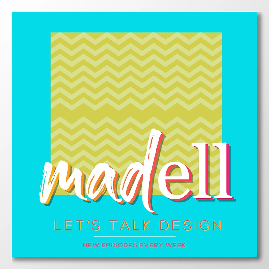
Yellow is a great contrast to blue which adds visual interest.
4. Colors and Fonts - The concept of your design should influence your choices in color and type. Essentially, every design decision you make should backtrack to your concept for direction. Choose colors wisely. Use them to set the tone of your piece.
For eg: A nice shade of blue will enhance your concept of relaxation. Similarly, use fonts to enhance your piece. A general rule of thumb to follow is to not use more than 3 fonts in one design.
Adding more pops of color

5. Repetition - In design, repetition creates relationship between elements. It creates a rhythm; a harmony. This point is often overlooked by amateur designers. You do not have to fill every corner of your design with different elements. Repeat patterns and fonts to keep the graphic visually connected in someway.
6. Balance - Make sure that the design weight is well distributed through the placement of your elements. A balanced composition feels stable and aesthetically pleasing; Whereas an unbalanced composition can lead to tension. In some projects, imbalance might be right for what you’re trying to communicate, but you generally want a balanced composition. This can be achieved through symmetrically or asymmetrically. Symmetry : Imagine a line running through the center of the page. The two halves of the design should contain the same amount of elements. Asymmetry : Balance is achieved not through mirror imagery, but by placing equal weight through contrast, shapes and sizes.
I added the 2 photos and played with the borders. Make sure the design weight is distributed well.

7. Movement - Movement is the path you create to guide the viewer’s eye through a piece of art. It is important for the user’s eye to flow from the focal point to the secondary elements seamlessly.
A subtle pattern helps move your eye through the design

8. Space and Framing - Let your art breathe. While working on the composition, be aware of the positive, as well as negative elements. Negative space is a great way to create interesting designs. Create a composition in a way that no one area of the design overpowers the other.
So there you have it. Some basics to keep in mind while designing :) Now go, create !